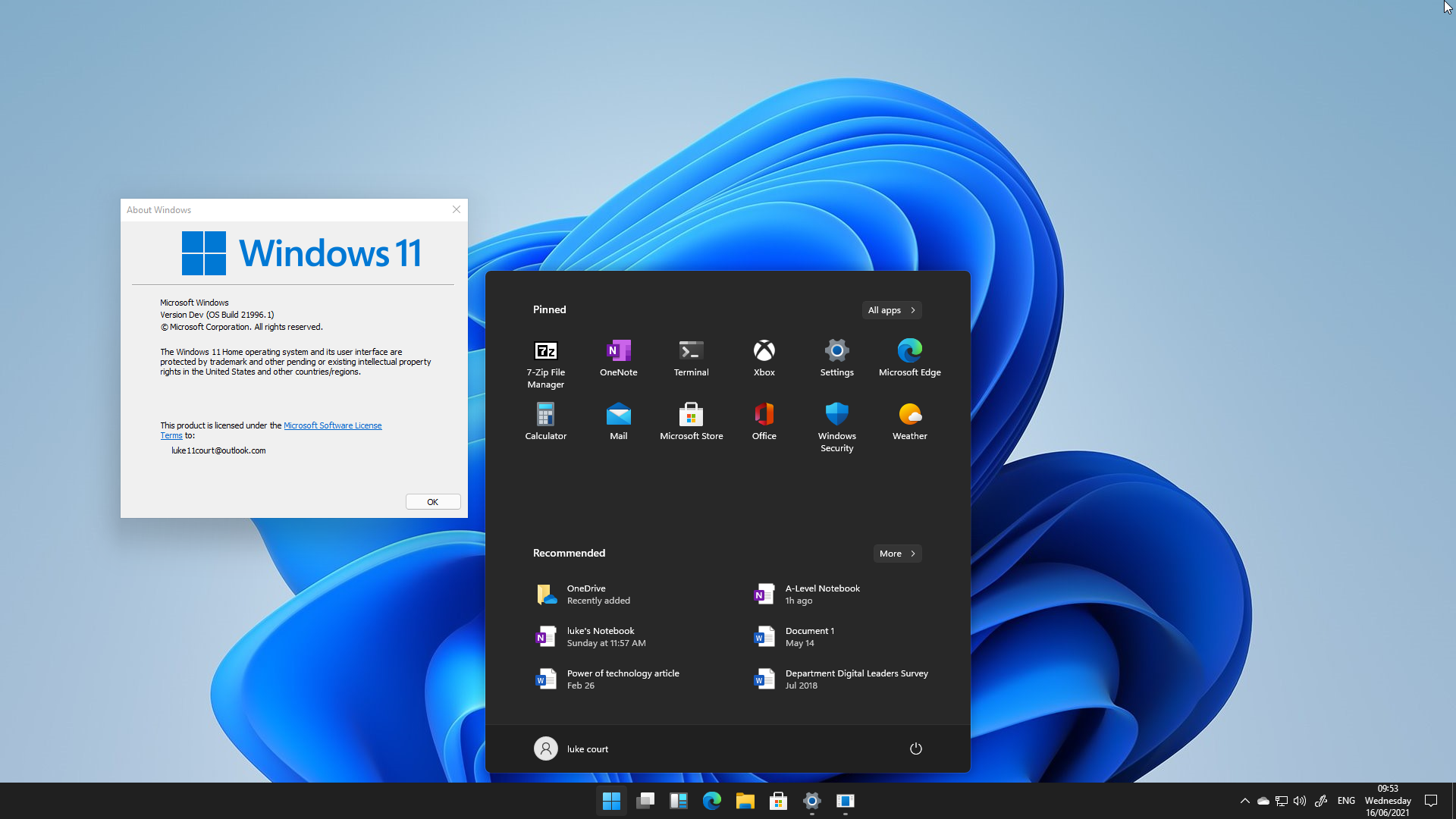
A build of Windows 11 has leaked online and it looks absolutely beautiful. However, there are also a lot of inconsistencies in the design that reminds me that this is an upgraded version of Windows 10 and not a completely new operating system. This is shown clearest in the fact that the control panel from Windows 7 is still around which shows that Microsoft is still working on transferring all the settings over to the new modern UI.
However, this build was made in May of this year and is not what we will see on June 24th next week because Microsoft will have been working on adding and improving these features before the reveal. With all of this out of the way, let’s get into the main features of the leaked build.
Start Menu changes
In the images above you can see that Microsoft has redesigned the start menu to be more streamlined and simpler to use with a pinned apps section and a section for suggested apps and files that the user has edited and/or opened recently as well as recently installed applications. They have also changed the alignment of the icons on the taskbar to be centred by default, whilst this looks nice to the eyes it also means that the icons on the taskbar will move to the left when a new application is opened. This is similar to the style of alignment seen on the MacOS dock.
Microsoft has also included a left-aligned start menu and taskbar option for users that would prefer the left alignment of the taskbar which can be seen in the images below. This does still use the new start menu style that’s been introduced in this build, however, in this alignment the start button stays in one position on the taskbar and doesn’t move when other applications are opened.
One thing that can be seen all over the new UI is the new icons that can be seen in all windows and the similarities with Windows 10x which was cancelled earlier this year. When Microsoft decided to stop the development of Windows 10x they did also say that some features would be coming to a future version of Windows which can be seen all over the new UI in Windows 11.
Multitasking changes
In the video above you can also see that the task view user interface has also been revamped with a more streamlined view which only shows the available desktops and the applications open on those desktops instead of the previous timeline view that existed before this and was confirmed to be leaving Windows earlier this year.
There is also a new UI for multitasking that appears when hovering over the maximise button on a window in a very similar way to MacOS but instead of just the options to move it left or right there is a multitude of options that can be seen in the image below.
As you can see in the image above there are multiple options for how this multitasking can be laid out on the screen including the standard split-screen option with one application on each side of the screen to having three apps side by side. The available configurations can be seen in the gallery below.
Conclusion
While I do think that this is a massive improvement from the current windows 10 UI I also believe that Microsoft could make some improvements by modernising the action centre, removing the old control panel and also allowing users to still use the old windows 10 start menu.
I’ll release a new article on June 24th when Microsoft will officially announce the next version on Windows with all of the official details.


Leave a Reply